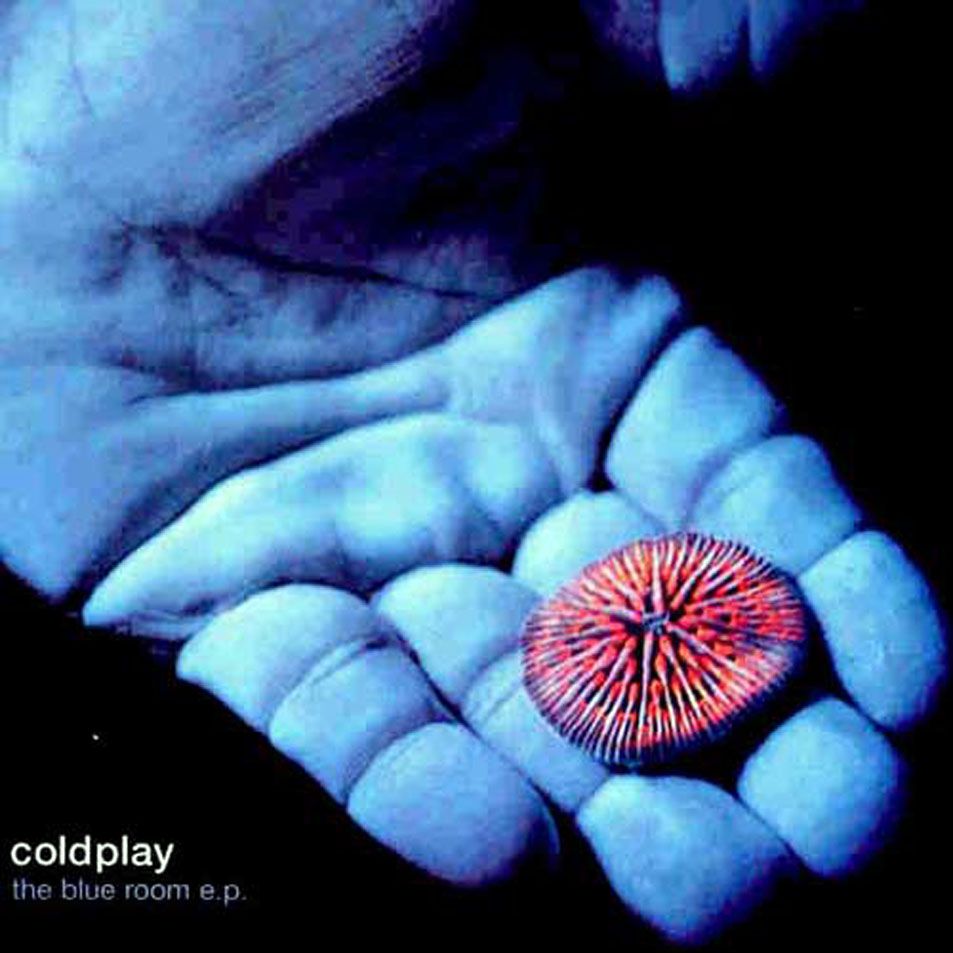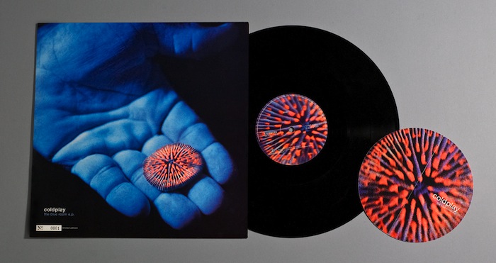
It took us a little while, but we managed to track down Tim Moore, the man responsible for designing the cover of Coldplay’s first release for Parlophone, The Blue Room EP, which was on October 11th 1999. Tim was kind enough to answer the questions we emailed about the cover.

Hi Tim. So, how did you come to design the cover for the Blue Room EP?
It was a lucky one, I had just graduated from Edinburgh College of Art & was in London planning a trip to Japan funded by the Royal Society of Arts I was discussing my work with a friend who had popped round and was mates with Claire O’Brien at Parlophone. He gave me Claire’s contact details, I made contact and showed her my portfolio at EMI. Luckily she really liked my sketchbooks, so she held onto them and mentioned she would show them to a new band she was working with, I was called back into Parlophone soon after that & ended up meeting with Chris and the band at their flat in Camden.
Was it among the first covers you designed?
I had done a few covers for Electronic Music artists – Global Communication but yes it was early days in terms of my commercial work
What had you trained in at college?
I trained as a Graphic Designer on the Visual Communication course at Edinburgh College of Art. I did my dissertation on the visualisation of music & that subject continues to fascinate & inspire my work.
Was there a specific brief for the Blue Room EP?
Both the band & the label had some ideas of how they wanted the cover to look, I remember feeling pretty hemmed in by the process. At that time I had no studio of my own and laptops were a bit out of reach on my budget, so due to time restraints and the way it all turned out I did the design in the basement of the EMI building in Kensington. It was full of people busy artworking EMI communications, this gave me my first taste of the realities of Commercial art for major record labels.
Who was responsible for picking the image and why was it chosen?
Chris Martin had this book on the National Geographic Photographer David Doubilet called ‘Water Light Time’ published by Phaidon. It contains incredible images of marine life & I was also really interested in underwater photography so it was decided to work with several images from the book. We had to contact the photographer’s agent and request the rights to the eventual image, in the end the image of a delicate coral in the hand worked best within the 12-inch format.
Were there lots of different options for the cover?
Not really no. It was a choice between 5 potential images and the coral in the hand worked best within the frame. Then it was a case of working with type to best balance the information with the beauty of the image itself.
Were the band involved with the process?
Not after the first meeting, no. I remember they gave feedback on the first visuals and liked the crop and the way in which the cover felt using a simple layout & clean typography.
I remember wondering how I could work more of my own ideas on this job, but to be honest at this time pure typography alongside photography didn’t play to my strengths. This was a lesson to me & soon after I ended up working for one of Europe’s top designers for 3 years to greatly improve my typographic skills.
Were you a fan of Coldplay’s music? Obviously it was very early days for them.
I had never heard of them before I received an early copy of the EP & knew straight away that they had a sound that would go on to be very popular. It wasn’t my kind of sound, but I did appreciate the production even then, the Bigger Stronger & High Speed tracks felt like well-honed pop records. I was fresh out of college, & had been djing and producing underground dance music since I was 16 so I didn’t take the music as seriously as I might have. I would certainly take the cover in a new direction now, but hindsight is a luxury of the past.
How much time did you spend on the design?
Probably about a week as I also did a promo mail out in the form of the coral from the cover image. I remember thinking the CD worked best, as the Digipac opened up and the CD on body was the coral with the hand sitting behind it under the clear tray to make it seem as you were removing the coral from the hand. It’s such a beautiful image and ended up working well across formats with the tone of the EP.
Were you pleased with the finished result?
I learnt a lot on the job and it was great to work with an image of such power, but I had little creative freedom & when the vinyl came out the record company had placed this huge white limited edition box below the type in the lower left hand corner without consulting me, which completely messed the entire balance of the cover and just felt like such a careless thing to do… I was pretty shocked by that to tell you the truth.
And what do you think of it now?
The cover is really the photograph & the photograph is excellent so it certainly works as an arresting image & fits the music well in terms of the mood, with almost ten years having passed there are lots of things I would change especially the type on the back – it makes me cringe. It’s probably the worst bit of typesetting I have ever let out into the world but as a cover it works well.
The EP goes for quite a bit on eBay now – do you still have a copy?
Yes I still have copies of the CD and vinyl release + some very rare and rather basic blank colour versions that have a varnished finish to them. I was lucky enough to be given the 0001 copy of the 12 inch so if anyone wants the first ever limited release of Coldplay’s Blue Room EP on Parlophone make me an offer! It’s been in my portfolio for some time, so it’s pretty mint.
Do you tell people about your role in Coldplay’s career?
It’s always been a useful door opener when it came to working for other labels & design companies, but it’s nearly ten years ago now so I don’t tend to bring it up that often. I am still proud to have been involved though.
Have you designed many covers since?
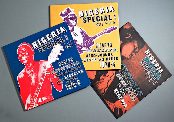
I have designed quite a few, but mainly for independent labels as on the whole that’s where I find a lot of the music I love. I designed the Nigeria Special series for Soundway records & created designs for other releases on that label.

Tim’s Nigeria Special covers
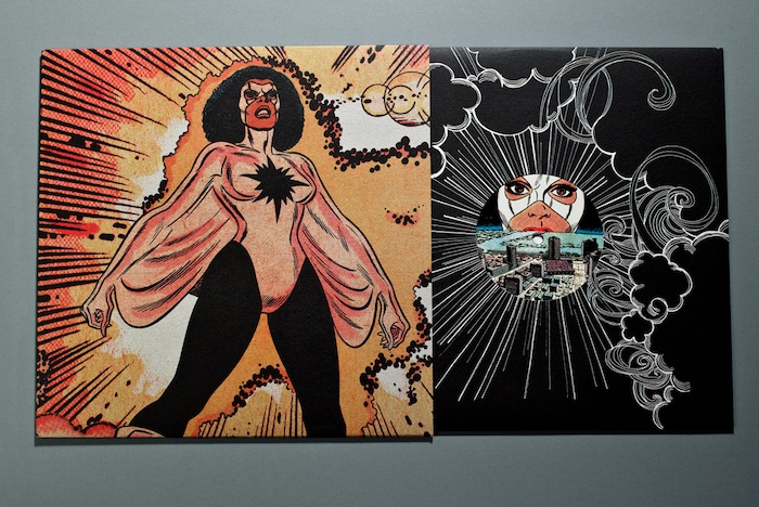
I Art Direct the House music label Prime Numbers out of Manchester, I also designed much of the early firecracker records releases & I am currently working on a new label for Electronic Sound records.

One of Tim’s Firecracker designs
Are you still designing? What do you work on these days?
As Art director of Nth Creative I get to design lots of different things which is how we like it, although we make sure thats it’s for things we like which sometimes reduces the big fees but keeps us inspired & engaged.
I design logos for companies such as Canongate books, websites for Galleries & a lot of work for the music industry. I am currently designing my brother’s new record label, I have just finished the cover for my new record which is out now… It’s a track called Shake Your Body Down by Discreet Unit on Prime Numbers. I am also trying to get time to design our new website as the current site is about 3 years out of date.
Shake Your Body Down by Discreet Unit
I am a visiting lecturer at Edinburgh College of Art, although since moving to Cornwall the visits have become less frequent. And when I get the time beyond all that I am doing up an old barn in Cornwall which I hope to turn into a studio in the very near future.
And do you still keep an eye on Coldplay’s progress?
I listen to a wide spectrum of music, but to be honest Coldplay’s sound is not regularly on my system. I did like the last album & could certainly hear the effect Brian Eno had in terms of the production, it’s great that they have been so successful & I hope it all stays positive for them.
Big thanks to Tim for taking the time to answer our questions.